Like everything else, shopping for groceries became more stressful when COVID-19 hit. And it wasn't just the shortages of yeast and toilet paper. It was the new, slapdash wayfinding systems. Namely, those easy-to-overlook directional arrows taped to the floor. The idea was well-intentioned: guide customers and uphold physical distancing measures by creating one-way aisles. The reality proved different.
If you’ve found yourself halfway down the cereal aisle before realizing you’re going the wrong way, you’re not alone. And you’re not to blame, according to Gillian Harvey, ’00 BDes, a wayfinding expert at the U of A.
“It’s not the user’s fault. It’s usually a fault of the system,” says Harvey, assistant professor in design studies and president of the Edmonton Wayfinding Society. That system falls apart if there’s no consideration for the people using it.
And it’s more than just signs. “An effective wayfinding system is sort of a visual ambassador to a place, saying, ‘Welcome! Let me help you explore and find your way around and enjoy yourself,’” Harvey says. It involves directories, maps, digital media, colour coding and typography. Together these elements help users create mental models of a place and get from point A to B, intuitively.
But the duct-taped directional arrows in grocery stores are not a welcoming ambassador. In fact, they illustrate a common design pitfall, Harvey says. They’re not visible enough. “Signs or maps should catch your eye,” she says. “They should be nice to look at and fit within the branding of a place.” Harvey shares some other examples of good wayfinding dos and don’ts.
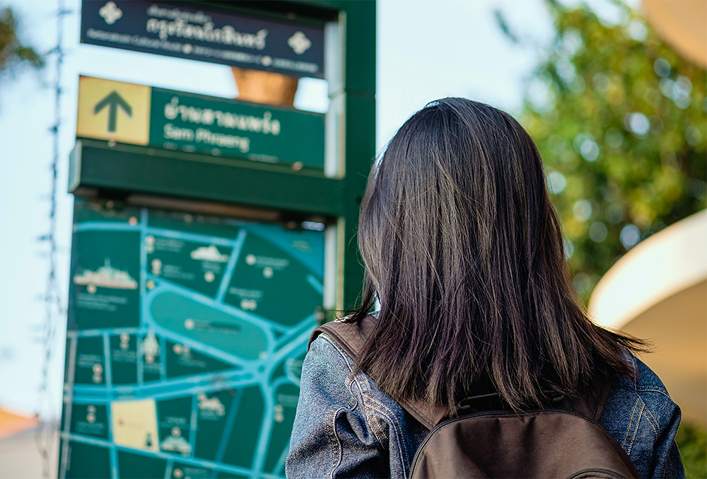
1: Don’t provide too much information
In wayfinding, it’s important to resist the urge to put all the available information on a sign. Stick to the info people need in that place and time. “Five to seven pieces of information is almost too much for people to remember,” Harvey says. “You want to keep it as minimal as possible.”
Take, for instance, the directories on U of A campuses, which don’t list classrooms. If they did, the maps would have too much information and would be difficult to decipher. Classrooms instead use a numbering system that is generally consistent across campus. It frees up space on campus signs for navigation between bigger landmarks, like buildings.
2: Do use consistent language
A wayfinding system is good if it’s consistent, says Harvey. “The system needs to be understandable by everyone, everywhere, all the time. Consistent language and information planning should make sure that the terminology used on the signs is understandable.”
For example, Harvey draws from her signs designed for the Grey Nuns Community Hospital emergency room in Edmonton. There’s an area officially called the “rapid assessment zone” but casually referred to by employees and patients as RAZ. So, when it came to deciding what should end up on the signs, “RAZ” was the obvious choice. “We want to use the terminology that people will understand.”
3: Do make it comprehensive
For Harvey, one historic example of an effective wayfinding system in its time is the iconic pedway signs in Edmonton designed by Lance Wyman in 1987. The iconic signs depict the word “ped/way” in Helvetica font with a pair of feet stacked horizontally in three rows. Based on the placement of feet on the sign, you can see if the pedway is underground, street level or skywalk. Unfortunately, Wyman’s wayfinding system wasn’t maintained or updated. As new buildings and connections appeared, they failed to follow the same format and some lacked signs altogether. The system has recently been updated, but the lesson still persists.
Wayfinding systems require upkeep and budgets, Harvey says. For that to happen, education and advocacy come first. “People have to recognize the value of wayfinding.”
4: Don’t forget why the signs are there
Have you ever found yourself completely lost after exiting the subway or getting off an elevator? According to Harvey, that feeling of disorientation says more about the wayfinding system than your sense of direction. Users want to know not just which direction to go, but how long it’ll take to get there.
Distance indicators are a wayfinding device that accounts for the user’s experience of a space. Increasingly found on pedway signs or city maps on streets, they tell pedestrians how long it will take them to get where they’re going and if they have time to stop for coffee.
“Distance indicators allow people to plan their journey and promote walking,” Harvey says. This wayfinding strategy helps people find their way around unfamiliar places. It also helps with navigation when the usual visual cues to help assess distance — like city blocks — are absent, as they are underground or indoors. “User-centred design really comes down to meeting users’ needs and painting a picture of the space so that people have a mental model of the area,” she says. “And it’s not a simple task.”
With that in mind, spare a thought for the hard-working managers and staff in grocery stores and other public spaces, who, post-COVID-19, have suddenly been called on to interpret public health instructions while also learning design and wayfinding principles on the fly.
We at New Trail welcome your comments. Robust debate and criticism are encouraged, provided it is respectful. We reserve the right to reject comments, images or links that attack ethnicity, nationality, religion, gender or sexual orientation; that include offensive language, threats, spam; are fraudulent or defamatory; infringe on copyright or trademarks; and that just generally aren’t very nice. Discussion is monitored and violation of these guidelines will result in comments being disabled.