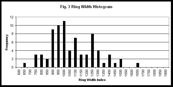
Once a flat file was generated, simple univariate stats such as histograms and correlation graphs could be plotted in Excel. In order to use PCA in the next step, a test of normality should first be performed. All data was roughly normally distributed. (Fig. 3,4)

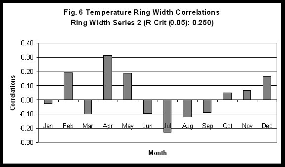
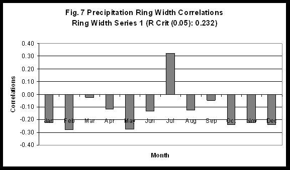
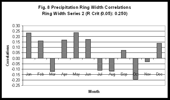
Correlations of ring width to monthly climate variables reveals summer temperature shows the most coherent and highest correlation (Fig. 5,6,7,8). At this stage, I wanted to keep the interpretation simple so I decided to retain only the monthly temperature variables for further analysis.
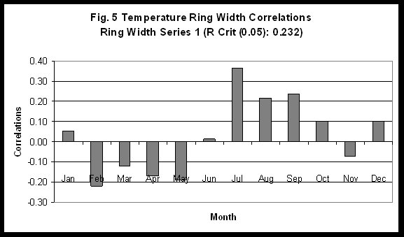
For explorations sake, before modeling many variables at once, I decided to derive a regression model based on our most highly correlated variable and series, namely the first ring series and July temperatures (Fig. 5). The resulting chronology is shown in Fig. 9.

Also, I plotted ring width variation (dimensionless index) and actual July Temperatures (Fig. 10).
