Analyzing, Reflecting, and Taking Action
The Student Perspectives of Teaching (SPOT) survey offers valuable insight into how students experience your teaching. While reviewing student feedback can feel emotional or overwhelming, it can also reveal what is supporting student learning and where adjustments may be needed.
A structured approach to review both qualitative comments and quantitative scores can help you make sense of your results. By systematically analyzing your SPOT results, you can identify strengths, see what is working well, and create a realistic plan to enhance the student experience in your next course.
Strategies
Use the strategies below to reflect on your feedback, identify patterns, and consider where change may be most valuable.
Review the big picture
Start with the Summary Tab in your report and examine the bar charts for each domain.
- Identify strengths: In which of the six domains is satisfaction the highest?
- Identify gaps: In which of the six domains is satisfaction the lowest? Is there a significant gap between your teaching intentions and the student experience?
- Pick a target: Identify your top three and bottom three domains. If you could only address one of the bottom three this year, choose the one that would have the biggest impact on student learning. This is your target domain.

Standard SPOT Questions Summary Data
| SPOT DOMAIN | Strongly Disagree | Disagree | Neither Agree Nor Disagree | Agree | Strongly Agree |
|---|---|---|---|---|---|
|
Design |
11 |
20 | 44 | 71 | 36 |
|
Utility of Course Resources |
10 |
23 | 24 | 88 | 38 |
|
Graded Work |
14 |
20 | 34 | 80 | 35 |
|
Course Delivery |
16 |
31 | 25 | 68 | 43 |
|
Instructional Approach |
7 |
31 | 32 | 81 | 32 |
|
Class Climate |
6 | 19 | 31 | 71 | 56 |
Sort your comments
Qualitative feedback can be overwhelming. Sort comments into these four “buckets” to make them easier to manage.
| KEEP | CHANGE | INVESTIGATE | LEAVE BEHIND |
|---|---|---|---|
|
Positive feedback on what is going well. TIP: Save these for annual evaluations, award applications, and tenure packages. |
Clear, actionable suggestions for improvement, specifically those related to your target domain. |
Conflicting feedback or comments that require more data to understand. |
Unprofessional or unkind comments that offer no actionable information. |
Reflecting with context
No single survey can capture the full complexity of a course. Your SPOT results are most useful when considered in a multifaceted way, alongside other sources of insight such as your own reflections, peer observations, and samples of student work.
Consider the following:
- How closely do student comments align with your own sense of how the term went?
- How did this feedback align with mid-term feedback from students, what peers observed, and what you noticed in your own reflections?
- If a domain’s score was low, what factors do you feel may have contributed?
Reflecting Using Data Visualization Tools
The SPOT report includes radar charts that provide a visual overview of the results across the six SPOT subsections. These charts help you analyze trends and consistency across different terms and courses. These charts are shared only with you to support reflection and formative evaluation. They are not shared with your department chair or dean for summative purposes.
How the radar chart works:
- The spokes: Each "spoke" radiating from the center represents one of the six SPOT domains
- The scale: The scale ranges from 1 (Strongly Disagree) at the center to 5 (Strongly Agree) at the outermost edge
- The polygon: Your course results are plotted as points on each spoke and connected to form a shaded polygon. The shape and size summarize your overall performance.
What to look for:
- Size: A larger polygon extending toward the outer edge indicates higher overall student agreement.
- Shape: Look for bulges (strengths) and dips (areas for improvement).
- Comparison: You can overlay charts from different terms to see if scores for a specific domain are moving outward (improving) or inward.
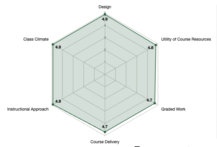
Image: A radar chart displaying six spokes, each representing a teaching domain: Course, Instruction, Assessment, Student, Interaction, and Student Agency. A shaded polygon connects data points on each spoke, showing a visual summary of student agreement levels on a scale of 1 to 5.
Understanding the interpolated median
The radar charts utilize an interpolated median to provide a precise, nuanced snapshot of student feedback on a 1-to-5 scale. Unlike a standard median or a raw average, this "weighted middle score" produces a decimal-valued result (e.g., 4.9) that more accurately reflects where the bulk of student opinion lies. By offering a more stable and representative summary than a simple mean, this calculation helps you better understand the typical student experience.
Creating a SMART action plan
Teaching is an iterative process. Choose one to three specific changes to implement next semester using the SMART framework:
- Specific: Consult the Framework for Effective Teaching to identify the indicators relevant to your target domain.
- Measurable: Decide how you will track impact (e.g., midterm feedback, assessment results, future SPOTs).
- Attainable: Ensure the change is feasible within existing policies and your current workload.
- Relevant: Align the goal directly with the feedback received.
- Timely: Set a clear implementation timeline.
Example:
If your students are confused about grading, your plan might be to create a detailed rubric (specific/relevant). The impact will be measured by comparing future "Graded Work" scores (measurable). You will focus on creating only one new rubric this term, rather than overhauling all grading criteria (attainable). The new rubric will be posted on the first day of the new term (timely).
Learn more
- Brookfield, S. (1998). Critically reflective practice. The Journal of Continuing Education in the Health Professions, 18(4), 197–205.
- Myllykoski-Laine, S., Parpala, A., Hailikari, T., & Postareff, L. (2024). Using self-reflection to support higher education teaching. Reflective Practice, 25(5), 589–604.
- University of Alberta. (n.d.). Framework for effective teaching. Centre for Teaching and Learning.
- University of Alberta. (n.d.). Student perspectives of teaching. Test Scoring and Questionnaire Services.
- University of Alberta. (2024). Teaching and learning evaluation policy.
- University of Alberta. (2024). Teaching and learning evaluation policy: Appendix B.