CTAs and Buttons
A call to action (CTA) is a clear action that you want the reader of the email to take. For example, “Donate Now,” “Read More,” or “Register Today”. CTAs typically take the form of a button in an email, but can also appear as linked text.
Emails should include one primary call to action (CTA) (with the exception being newsletters and digests). It’s recommended to include CTA early on for those who are ready to take action and again at the end of the content for those who need additional information before taking action.
Buttons
Follow these best practices when using buttons in your email:
- If using Campaign Monitor, use the largest possible size.
- Buttons should be a minimum of 45px X 45px (Source - the button should be easily clickable with a thumb for those reading on mobile).
- Have ample whitespace surrounding the button. Aim for 30-50px of whitespace surrounding the button. This makes it easier for people reading your email on a mobile phone to click the button.
- Colours: Yellow background (#F2CD00) with black text.
- Use bold and large text
- Use rounded corners
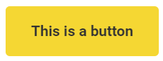
Your CTA buttons are the U of A’s primary yellow colour with black text and should look like this:
Hyperlinks
Using hyperlinks is a good way to include an opportunity to click earlier in the email in an organic way. Hyperlinks should be:
- A different colour from text
- Underlined
- Only underline linked text as many people in the population are colourblind, so it’s best to have multiple cues that the text is a link. Don’t use underlines for emphasis if it’s not a link because readers might mistake your underlined text for a broken link.
- Link relevant text
- Screen readers will read the text so ‘click here’ doesn’t provide contextual clues that are helpful for the email’s recipient to understand where the link will take them.
Eg: