Templates
There are several U of A Branded generic templates ready for you to use in your Campaign Monitor account. Using these templates across the institution gives consistency to our messaging and helps with alignment to the branding guidelines. The templates also allow for flexibility with your content while still remaining true to the One University brand.
The templates were created to cover all of your email needs, whether you need to send newsletters, event invitations, or memos, etc. The templates are also mobile-friendly, ensuring that all of your emails will look great, regardless of what device your readers are using. They were also built to work in Dark mode.
The templates use the primary U of A colour palette, which should not be changed to different colours. You are free, however, to use whatever imagery you’d like in the body of the email to convey your unit identity.
Fonts
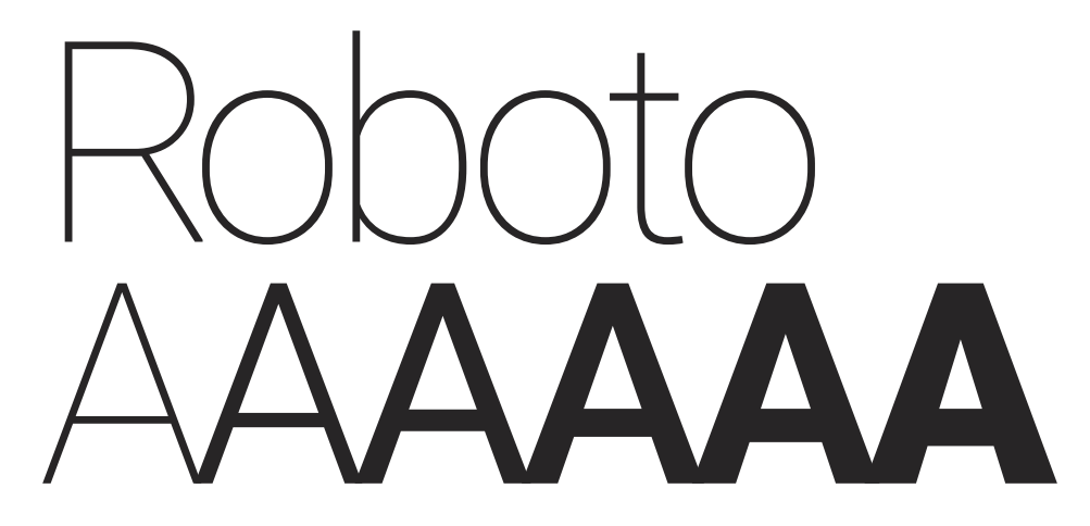
The official U of A font is Roboto, so you should make sure that you use it in the body of your emails. Roboto was chosen as the official font because it is widely available and comfortable to read by anybody, making it accessible. In the case that Roboto is not available, it should be substituted with Calibri.
Use the following font sizes in your designs:
Banner text
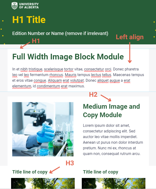
H1 Title
- Green template: 40 px yellow font
- Yellow template: 40 px black font
Edition Number or Name
- Green template: 20 px white font
- Yellow template: 20px dark grey font
H1 headings
- Green template: 34 px green font or 34 px green font (if against yellow background colour)
- Yellow template: N/A
H2 headings
- Green template: 28 px green font or 28 px yellow font (if against yellow background colour)
- Yellow template: 28 px yellow font if against green background colour; 28 px black font (if against yellow background colour)
H3 headings
- Green template: 20 px green font
- Yellow template: 20 px green font
Body text
At least 16 px dark grey font

Copy Best Practices
Section Headings
Including section headings in your emails helps to organize them. Headers help to break up blocks of long content and provide an anchor for the reader’s eye that helps guide them so that they can quickly scan, read your content quickly, and understand what’s important. Headers are also important to include for accessibility’s sake because they help people using screen readers to navigate through your email.
When you’re writing your copy, think in terms of sections. Which information is the most important, and how should your information be organized? Make use of H1, H2, etc, to help differentiate your sections.
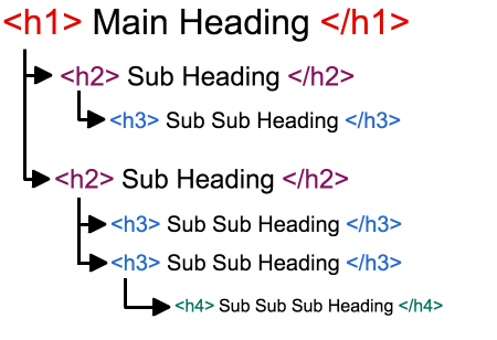
H1 is your primary headline. Subsequent headings (H2, H3, etc.) are subheadings.
Body Copy
Here are some tips to consider when creating your email body text:
- Keep it short - Did you know that the average time spent reading an email is just 10.0 seconds ? Most people are inundated with messages, so keeping your message short makes the best use of your reader’s time. This includes using shorter sentences.
- Write from a mobility and accessibility-first perspective. Use plain, easy-to-understand language with no jargon. This also includes using shorter paragraphs and sentences.
- Left align your body copy. Headlines can be centred but especially if your copy is longer than 3 lines, left align.
- Keeping your line height between 1.5 and 2 is best for accessibility.
- The majority of the text of your email should be live text, that is, not overlaid on top of images and videos. Images and videos don’t always load, so this way, your reader can still understand your message.